Predictive Maintenance
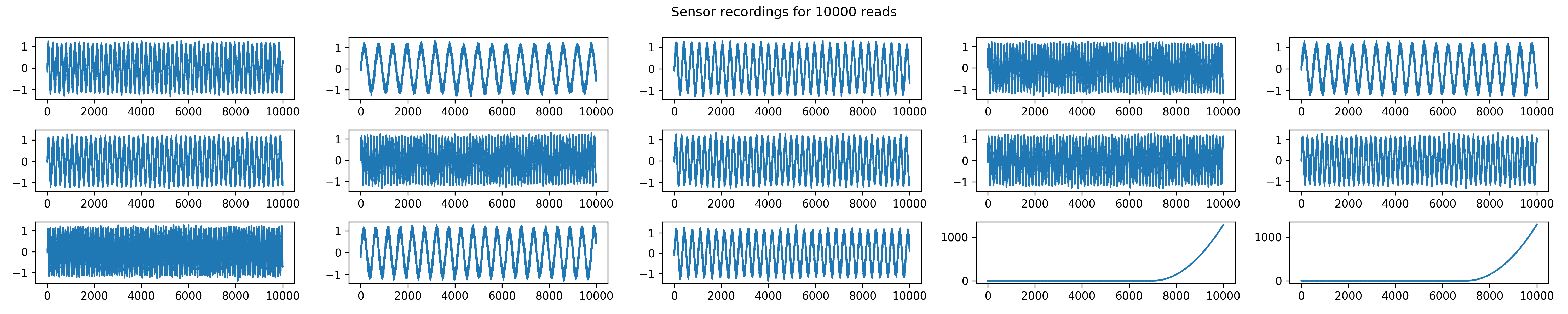
Machines require regular maintenance to avoid breakdowns. When machines fail on a production line, downtime disrupts operations. To monitor a machine’s health, sensor data can be analyzed. In this example, a machine with 14 sensors is examined. The first plot shows the sensors over time as sinusoidal functions with noise. The last two sensors show significant deviations later, indicating a potential issue requiring maintenance.
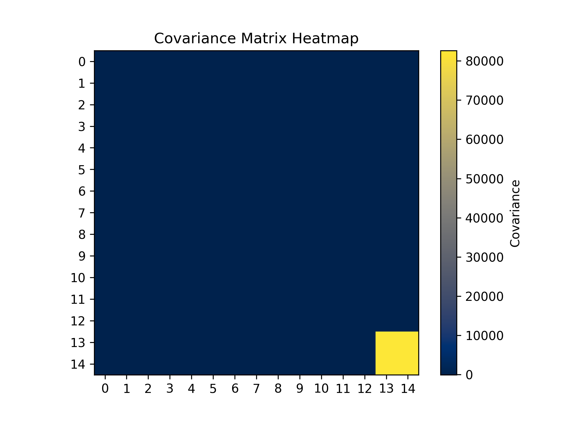
 To determine whether a machine needs checking, we calculate the covariance matrix, which shows the variance relationships between the 14 features. The variances are given by the diagonal elements as
\(\text{Var}(x_i) = \sqrt{\sum_{j=1}^{N}(x_{j,i} - \bar{x}_i)^2},\)
where $x_{j,i}$ denotes the $j$-th entry in the $i$-th feature, with $j \in [1, 10000]$ and $i \in [1, 14]$. Here, $\bar{x}_i$ denotes the mean of the $i$-th feature.
To determine whether a machine needs checking, we calculate the covariance matrix, which shows the variance relationships between the 14 features. The variances are given by the diagonal elements as
\(\text{Var}(x_i) = \sqrt{\sum_{j=1}^{N}(x_{j,i} - \bar{x}_i)^2},\)
where $x_{j,i}$ denotes the $j$-th entry in the $i$-th feature, with $j \in [1, 10000]$ and $i \in [1, 14]$. Here, $\bar{x}_i$ denotes the mean of the $i$-th feature.
The off-diagonal elements are given by the covariances as \(\text{Cov}(x_i, y_m) = \sqrt{\sum_{j=1}^{N} \sum_{n=1}^{N} (x_{i,j} - \bar{x}_i)(y_{m,n} - \bar{y}_m)},\) where $x_i$ and $y_m$ represent two different features. The indices $j$ and $n$ iterate over all entries of both features. $N$ is the total number of observations, which in our example is 10000.
The heatmap of the covariance matrix reveals that most of the variance is explained by two sensors, consistent with the earlier observations.
The heatmap of the covariance matrix reveals that most of the variance is explained by two sensors, matching the earlier observations.
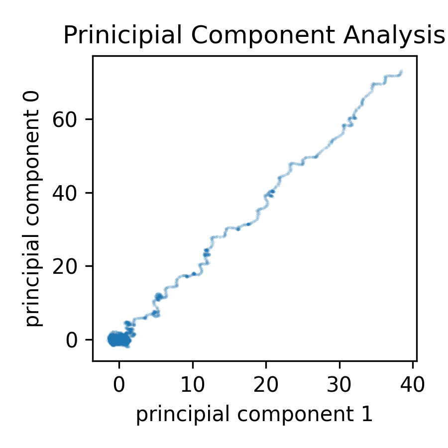
 Next, we compute the eigenvalues and eigenvectors of the covariance matrix to identify the directions of greatest variance. The third plot projects the data onto the space defined by these eigenvectors, showing most points centered around (0,0) with some deviations.
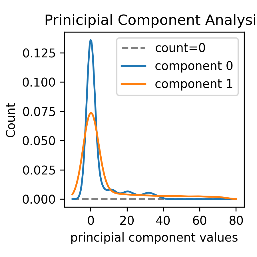
 Another helpful tool is the density function of the distribution above. The following density function provides more insight into how the two principal components are distributed. We can see that most of the values are close to 0, with some outliers at higher positive values. This aligns with the two-dimensional plot of the principal components from earlier.
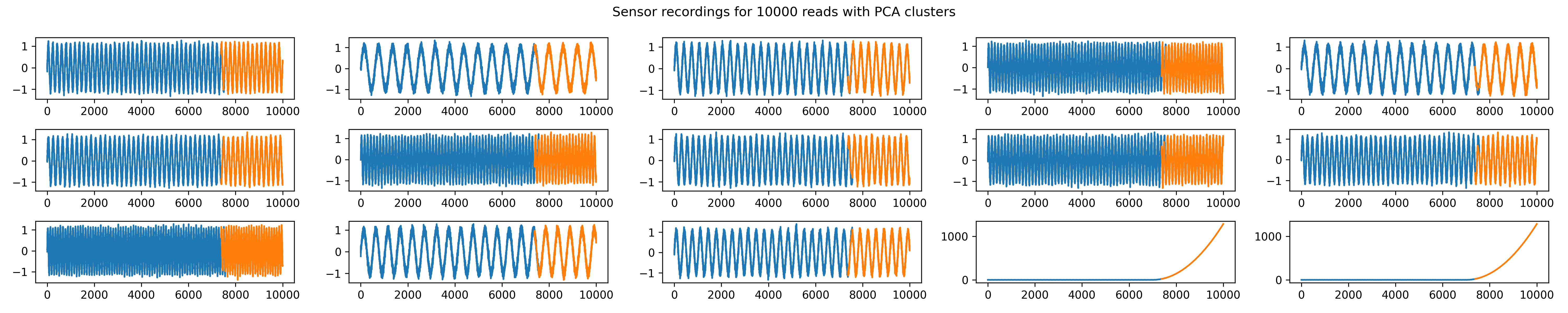
 To automatically distinguish normal from abnormal data, we apply the EllipticEnvelope algorithm. The fourth plot highlights normal data points in blue and outliers (potentially indicating a machine fault) in orange, clearly separating the machine’s good and bad states.